Freezer Fix: Brand Identity & Packaging
The Challenge: Develop a packaging and brand identity system for a mock ice cream brand inspired by my mom's community-famous Pistachio and Mango recipes, while breaking away from the oversaturated script and handwritten aesthetics typical of the dessert industry.
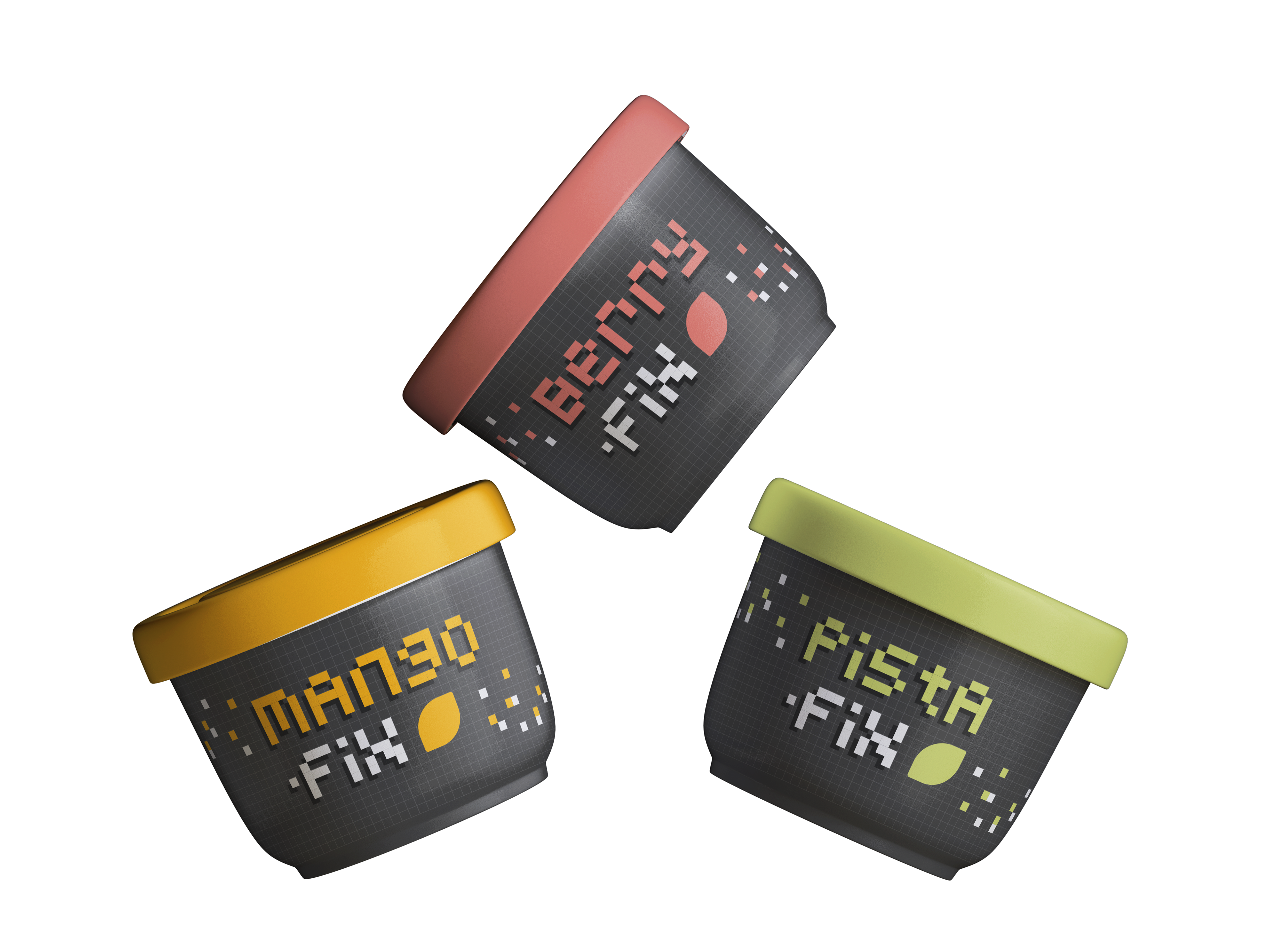
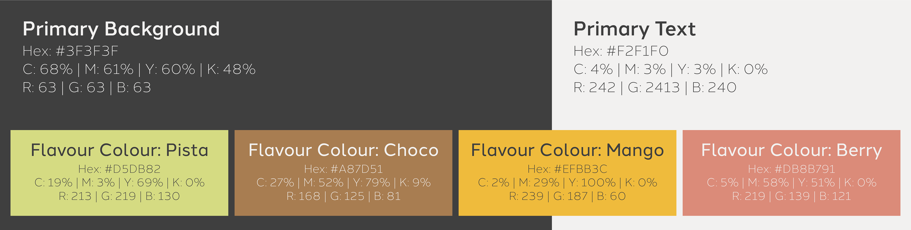
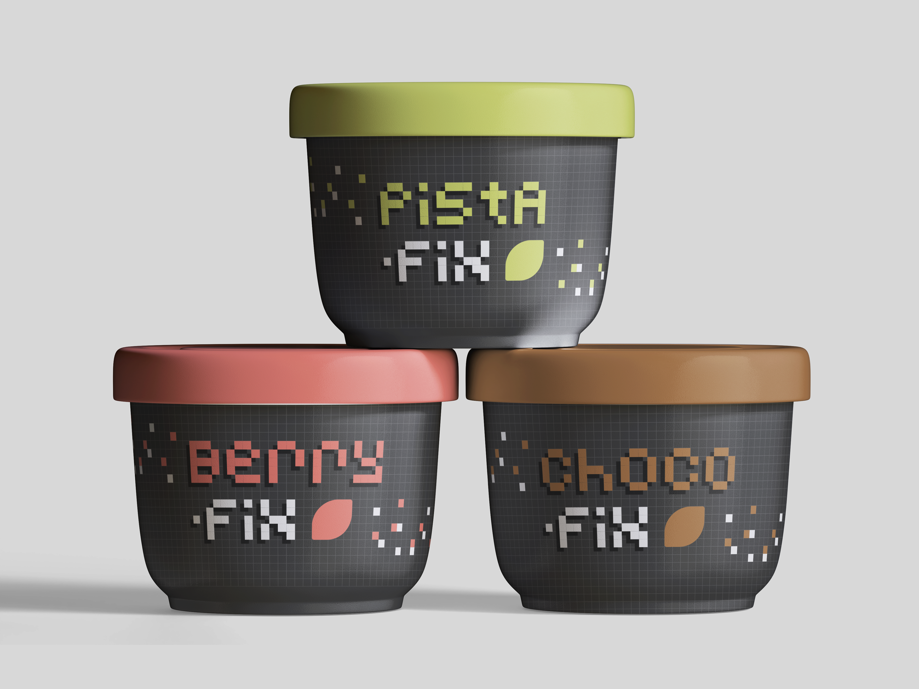
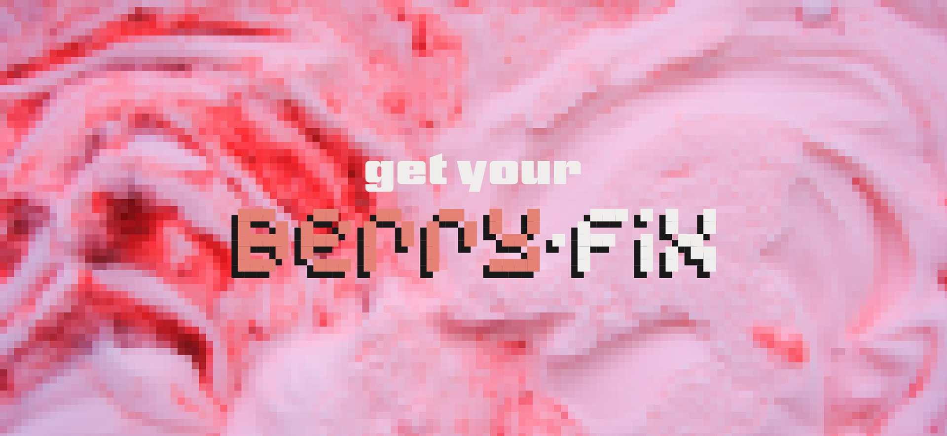
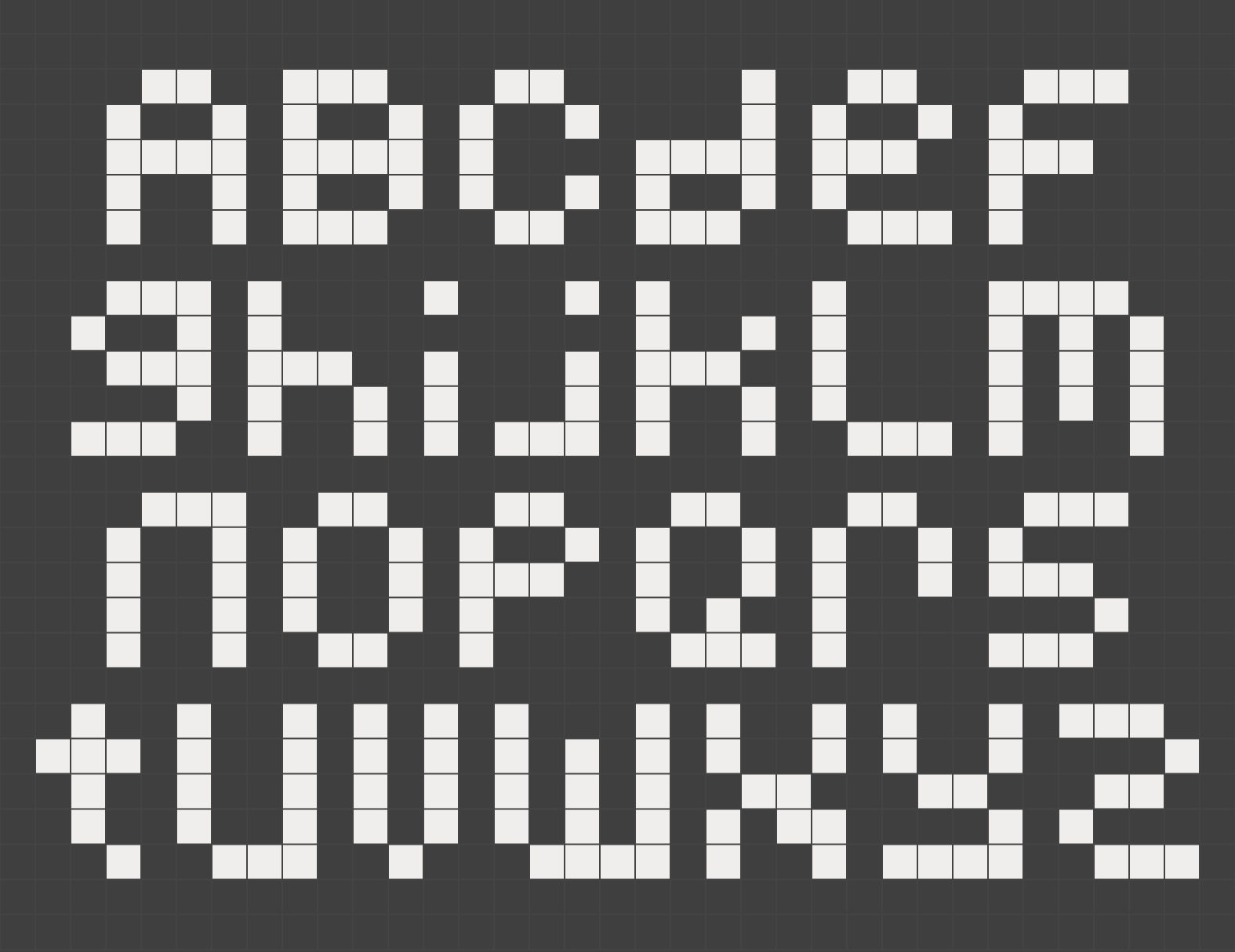
The Solution: I leaned into an intentional 8-bit retro aesthetic, creating a direct link between the product and the design system: ice = cube = pixel. To bring this brand to life, I designed a custom pixel typography system and a geometric grid pattern. The high-contrast system uses a deep charcoal background to make the vivid, flavour-specific colour palettes pop, showcasing how a unified visual language can seamlessly flex across a full product lineup.
The Solution: I leaned into an intentional 8-bit retro aesthetic, creating a direct link between the product and the design system: ice = cube = pixel. To bring this brand to life, I designed a custom pixel typography system and a geometric grid pattern. The high-contrast system uses a deep charcoal background to make the vivid, flavour-specific colour palettes pop, showcasing how a unified visual language can seamlessly flex across a full product lineup.